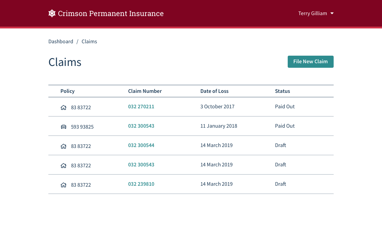
Reducing Duplicate Claims
Duplicate claims are expensive for insurers. Every claim, even duplicates, must be processed; taking time, money and resources. The goal for this project was to help a user prevent making duplicate claims, or resolve an existing duplicate claim.
The project manager for this project initially just saw this feature as a cost-saving exercise for the company. But duplicate claims also waste time and energy for the end user. Making an insurance claim usually means the policyholder has suffered a difficult or disruptive event, and there are lots of reasons why a user might start a claim and then get distracted at some point in the process.
The UX maturity of this company was on the rise, and this story was a great opportunity to break out of this zero-sum kind of thinking and find a solution that was beneficial to both the company and the policyholder. Prior user research had allowed for the creation of several policyholder personas which were useful for making this argument.

Policyholder Jack
- Desktop user
- Prefers to use agent
- Willing to do some tasks online

Policyholder Tasha
- Tablet and mobile user
- Will try chatbot
- Prefers to do all tasks online
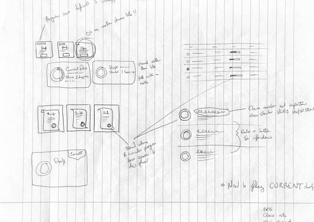
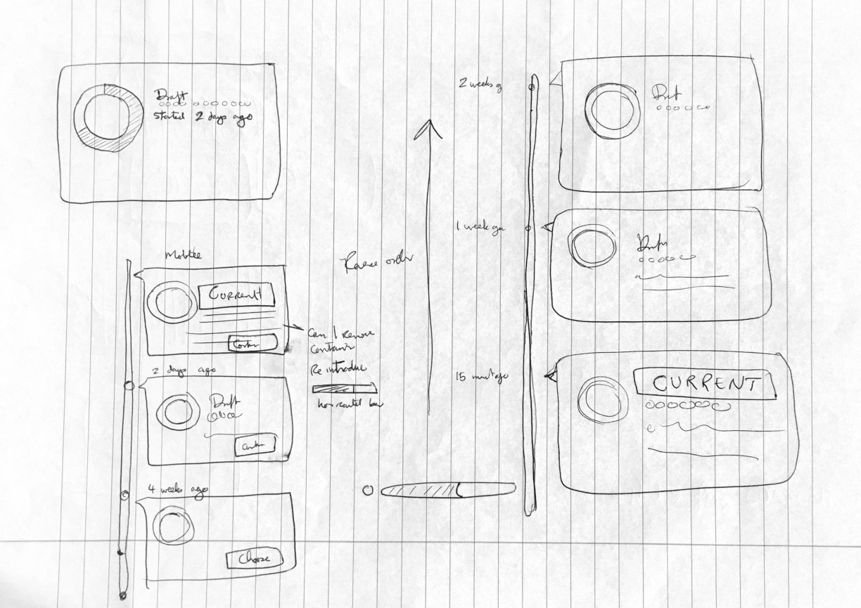
At the wireframe phase, I set out to find a way to visualise the completeness of several similar claims, and their creation dates.
Highlighting when the claim was created could help the user remember when they made each of these claims. The level of completeness could help the user identify which version of the claim had the most effort put into it so far. Both of these factors are useful for deciding which copy of the claim is the best to continue with.
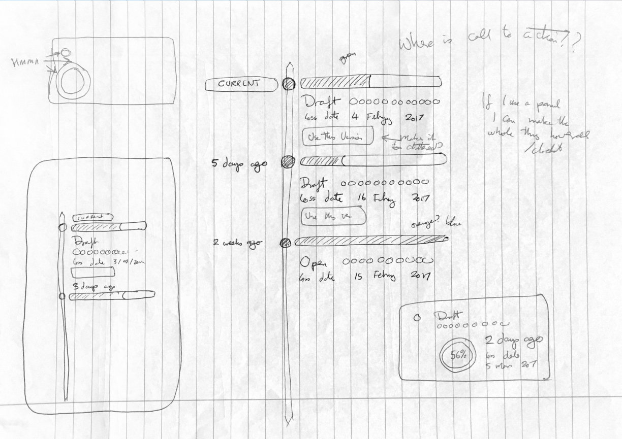
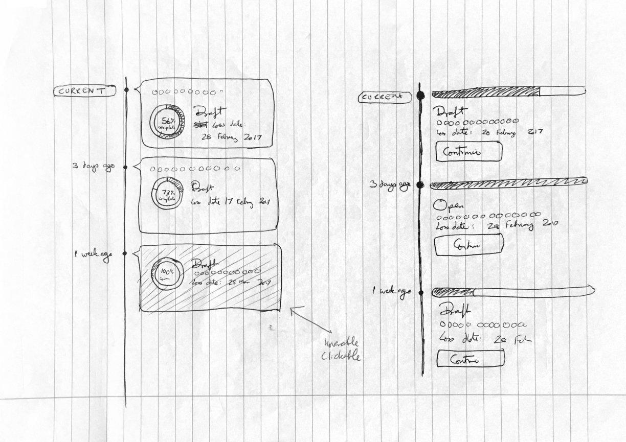
In the design phase, I went for a timeline approach, with pie charts to show how far the user had gone in the process. The end result was a flow that would allow a user to identify and pick up an abandoned claim.
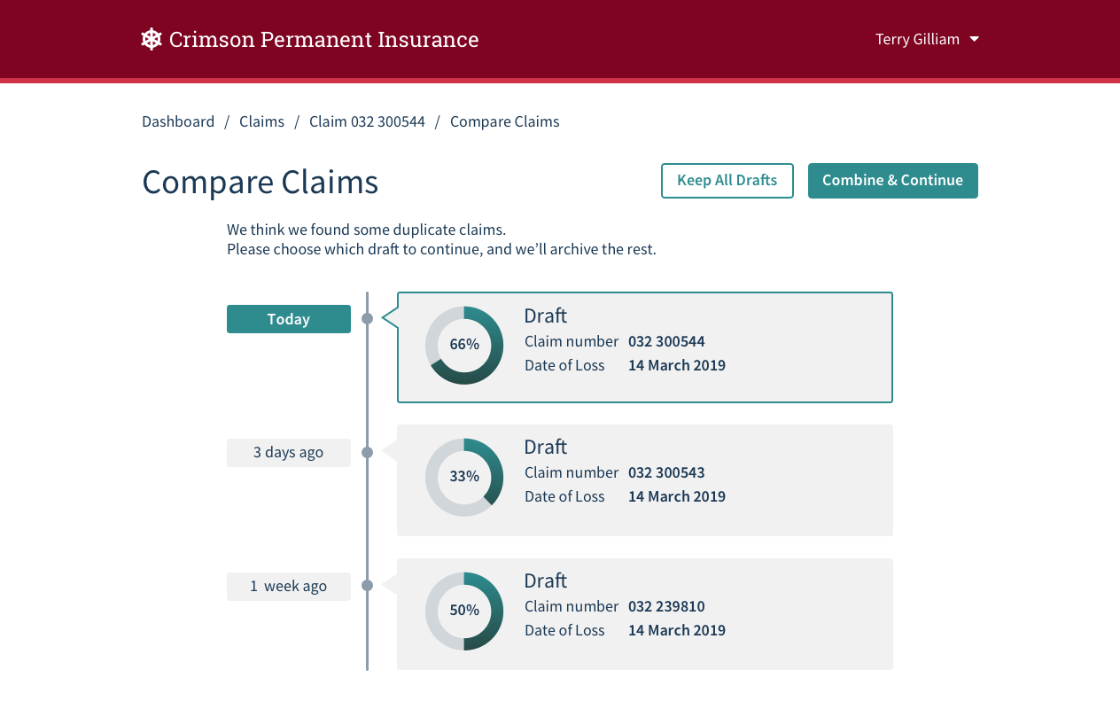
This new feature could save the policyholder time and effort, have a tidier claims list, and feel supported by their insurance company. And the PM saw that we could both seek to improve a company’s bottom line while also making the product better for the CSR and end user.