Self-service Banking Application
For this project, I was assigned to a complex financial application, that allows small business owners to set up financial services by themselves online. The project manager was very excited to include a business phone number lookup API into the service to decrease the length of the onboarding flow and save the user time and effort. I collaborated with a UX research team on this project, who found and interviewed the very specific users we needed to validate the project.
In this case study, I’m focusing on the early part of the user journey, and how we iterated this design based on user interviews.
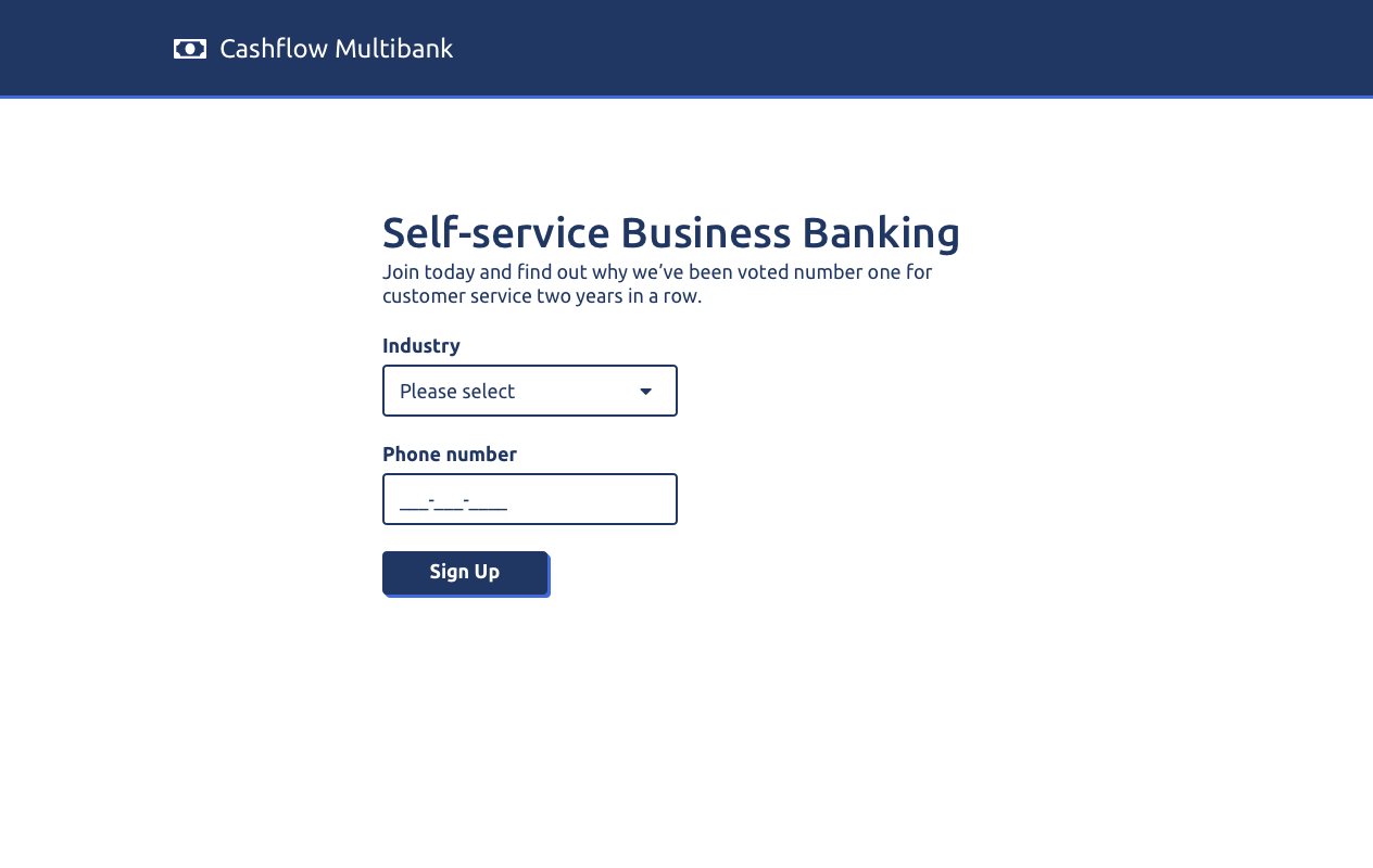
Our first iteration of the flow was as short and simple as possible - draw the customer in with a simple and approachable landing page, take them through a brief set of pages to collect additional information, and get them to the pricing page as quickly as possible. Perhaps unsurprisingly, the first set of users responded poorly to the request for a phone number so early in the journey. Some feared that telemarketers would harass them, and interrupt their business. Others mistakenly assumed that their phone number would be used as a life-line if they got stuck.


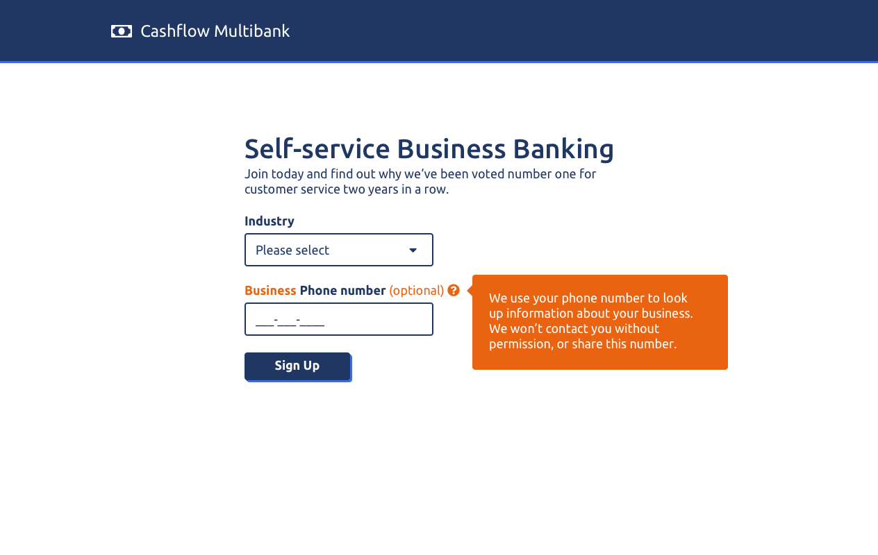
Customer trust is a huge factor for in the financial services industry, so it was crucial for us to communicate to the user exactly how their contact information would be used, to dispel some of their fears, and help them feel more empowered. For the next iteration of the design, I worked with the UX research and documentation teams to add more detail to the micro copy on the landing page and beyond:
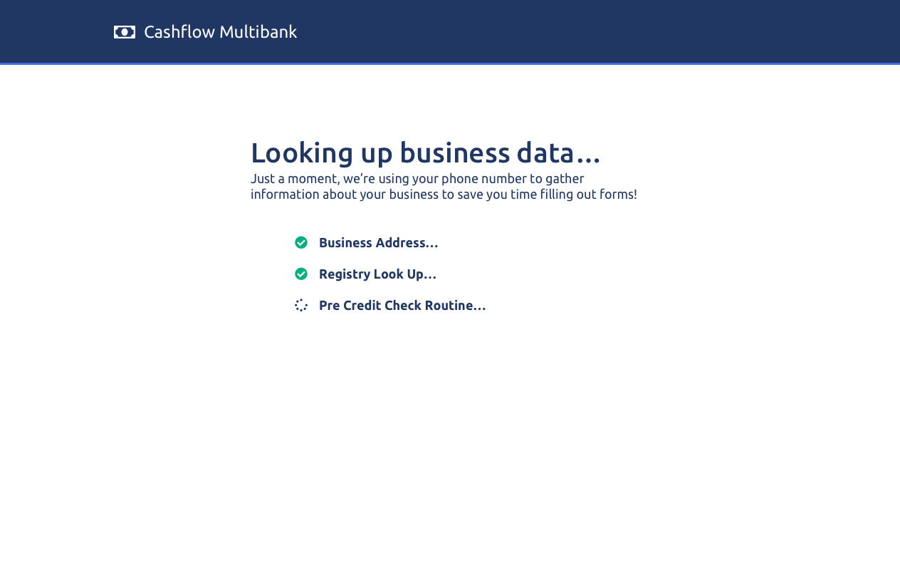
- We added a loading screen after the landing page with animated text to provide transparency about how the system was connecting their phone number to useful information.
- We added a tooltip on the landing page to provide more information to users about how their phone number would be used.
- We emphasised that we wanted their business phone number rather than a personal phone number.
- We made the phone number optional; a user could still enter their details manually on later pages if they didn’t feel comfortable providing a phone number straight away on the landing page.


The next round of user interviews showed that our updates helped to reduce user fears around their contact information. It also became clear that there were two main user strategies for using the product; some users wanted to get through the process as quickly as possible, happy to skim over the details, while another distinct group wanted to feel well-informed and in control by reading as much informational text as possible.
Overall, some users were satisfied that the service was useful enough and trustworthy enough to proceed with, but the phone number was still somewhat of a hurdle.
The next iteration of user research for this project should focus more on how to provide supporting information for the “info-seeker” type of user, while keeping the flow sleek and approachable for the “skimmer” user.